


SCADALink
SCADALink is an industrial technology company specializing in SCADA (Supervisory Control and Data Acquisition) and remote monitoring solutions for industries such as oil & gas, utilities, and environmental monitoring. As the company transitioned from its former identity, Bentek Systems Ltd, to SCADALink, I served as the Website Development Lead. In this role, I guided the rebranding of the company’s online presence — redesigning the website, refreshing its visual identity, and creating supporting marketing components to ensure the brand communicated professionalism, clarity, and innovation.
My Role
Rebranding, digital wireframing, low-to-high-fidelity prototyping, iterating on and implementing designs, creating graphical website and marketing assets
Timeline
May 2025 to August 2025
Tools Used
Figma
Wordpress
Adobe Photoshop
Canva
Overview
Problem
SCADALink’s website was outdated, disorganized, and no longer reflected the company’s new brand identity. The redesign aimed to modernize the site, improve navigation, and create a more engaging experience for customers.
Goal
To redesign the website to align with SCADALink’s new brand identity and improve user experience.
o1
Specifications
As SCADALink transitioned from its former identity, Bentek Systems, it became clear that the company’s website was falling short. Outdated in both design and functionality, it no longer represented the modern, professional image the brand wanted to establish. After reviewing the site myself, studying a previous audit, and meeting with multiple team members, we identified three key areas to focus on for the redesign:

Rebranding
Select new brand colors and typography to replace the old Bentek Systems styling.
Create a consistent theme that reflected SCADALink’s modern identity.
Update imagery and supporting visuals to match the refreshed branding.

Navigation
Redesign the navigation bar, which was previously cluttered and missing important links.
Reorganize content into clear, intuitive categories.
Improve page layouts to make information easier to access.
Engagement
Add call-to-action buttons on product pages for direct inquiries.
Integrate a contact form that pops up instantly when a user requests information.
Implement a Google Calendar scheduling feature so customers could directly book calls with sales.
02
Designs
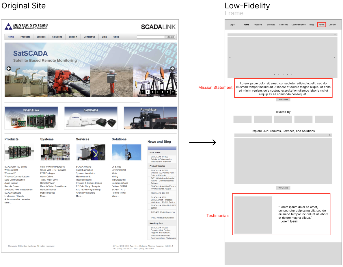
Low-Fidelity Wireframing and Prototyping
With the key issues identified, I began developing low-fidelity wireframes and prototypes to explore solutions for each challenge.
Rebranding
At the low-fidelity stage, there wasn’t much that could be done visually to address the rebranding aspect, since the new brand package ( including finalized colors and fonts) hadn’t been developed yet. However, I focused on shaping the voice and structure of the website to better represent SCADALink’s identity.
An “About” tab was added to give the brand more personality and help users connect with the company’s story.
The home page was reimagined to feel more authentic and engaging by featuring a mission statement front and center, highlighting key products, systems, and services, showcasing testimonials to build credibility, and including a section to display companies we’ve worked with to reinforce trust and industry reputation.
Navigation
For navigation, I reorganized and renamed tabs to make the structure more intuitive.
The “Sales” tab was confusing and redundant next to “Contact Us” — one led to a sales contact form while the other simply displayed contact information. Combining them into a single tab simplified the experience.
The tabs for ‘Products’, ‘Services’, and ‘'Solutions’ were reorganized for easier navigation and better viewing. This also made it more clear as to how each item was organized and what category it belonged to.
Each page listing multiple products, services, or solutions had redesigned page menus, allowing users to filter by category.
On specific individual item pages, I replaced the previous top-tab layout (which made it easy to miss content) with a side menu that allowed all information to be seen at once.
Engagement
For customer engagement, I introduced several features to make it easier for users to connect with the sales team. It was clear from the beginning that SCADALink did not want an e-commerce-style shopping experience, so all tools focused on facilitating direct communication with sales.
A “quote list” icon on the top bar allowed customers to add products they were interested in, creating a simplified form to request a quote — eliminating the need for them to manually type product names.
Clear call-to-action buttons were added on both product lists and individual product pages to streamline inquiries.
Calendar integration was explored, letting customers see availability and schedule calls directly, reducing back-and-forth communication.
Feedback Before Moving to High-Fidelity Prototyping
Testing the design with mutliple team members, feedback was gathered and adjustments were made accordingly before moving to high-fidelity designs.
Rebranding Feedback
The “companies we’ve worked with” section was removed temporarily because permission to display them had not yet been secured.
To add more brand voice, a small About section and a Benefits section were included, giving users a better understanding of SCADALink’s mission and value.
Navigation Feedback
On pages listing multiple items, the filter was moved to a side menu so users wouldn’t have to scroll back to the top to change selections.
On individual item pages, the top navigation bar was retained but made more distinct, and section tabs were updated to allow users to scroll to specific sections seamlessly.
Engagement Feedback
In terms of engagement, the multiple-product quote functionality was removed in favor of a simple call-to-action button that pre-populated the product in the contact form
Calendar scheduling remained as an optional, convenient alternative for users who preferred to book calls directly.
03
Outcome
Rebranding Package
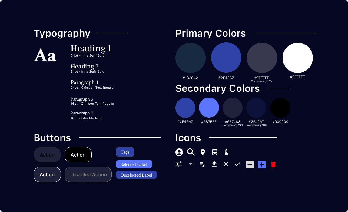
Finally, we created a rebranding package to establish a cohesive visual identity for the new SCADALink website. We retained the original blue from the logo as the main brand color to maintain continuity and convey a calm, professional tone. A secondary blue was added for complementary elements, and a green accent color, inspired by the wall colors of the building we worked in, was chosen to provide contrast and highlight key interactive elements. For typography, we kept Helvetica, which was already used extensively throughout existing materials, ensuring consistency across the site.
Final High-Fideilty Prototype
With the feedback, finalized layout decisions, and rebranding package in place, a high-fidelity prototype was created. This stage brought together every element — the refined navigation structure, improved user engagement features, updated home page content, and the new visual identity. The result was a cohesive, modern design that not only reflected SCADALink’s refreshed brand but also delivered a clearer, more engaging user experience across the entire site.
Original Website

Final Design

Takeaways and Future Steps
This project was an incredibly valuable experience in bridging design strategy, branding, and user experience. Through the redesign process, I learned the importance of balancing usability with brand storytelling, ensuring that design choices not only look good but also serve clear business and user goals. Collaborating with the team and incorporating feedback at every stage helped refine the final design into something cohesive and purposeful.
While my role as a designer concluded after completing the high-fidelity designs, the project is now in the implementation phase. I contributed to updating a few pages myself, including the updated contact form, which can already be seen on the live site. The remaining updates, including the new layouts, branding, and engagement features, are currently being developed and rolled out by the internal team.

Choose Another Adventure
-
![]()
Data Intelligence For Health - ML Platform
Designed and developed the frontend of a machine learning application aimed at making ML methods accessible to users of all experience levels — with no coding required.
-
![]()
Truffle Time Inc.
Developed a childcare business application that streamlines the booking process, ultimately making childcare services more accessible and user-friendly.
-
![]()
Calgary Animal Shelter
Created a compelling case study on an app designed for a Calgary animal shelter as part of the Google UX Design Certificate, showcasing user-centric solutions.


